I decided to design a whiskey label because at first it would be fun, challenging and I could maybe throw in some sketch work. There you have it, except, I don’t design like that because I need a reason to design something. My art has always needed a vessel to exist, so I started to dive into the world of Whiskey, Bourbon and other Spirits. When I say dive in, even though I love a great Bourbon, I actually needed to do this one without the haze.
First I started looking into the financials of the Market. The whiskey market alone was valued at $80.5 billion in 2021 and is forecasted to reach $127 billion by 2028. That is a growth of CAGR of 6.34% by 2028 and matches previous growth.
The second thing I needed to figure out was, how would I design this label. So this is when I did research to determine what makes a good whiskey. After taking a pretty good history lesson from Google search, I found out what goes into each style, fermentation, the aging process, and that is just the basic process of making whiskey.
The last step I needed to do was figure out what has worked in the past, what will work in the future and how to make it stand out as a label with universal appeal. As you can guess, a couple of things kept started to define a good label. Every mainstream label design was based on tradition, prestige and craftsmanship. I thought about trying a bold new way, but I completely agree with thought behind each of the top brand’s label designs.
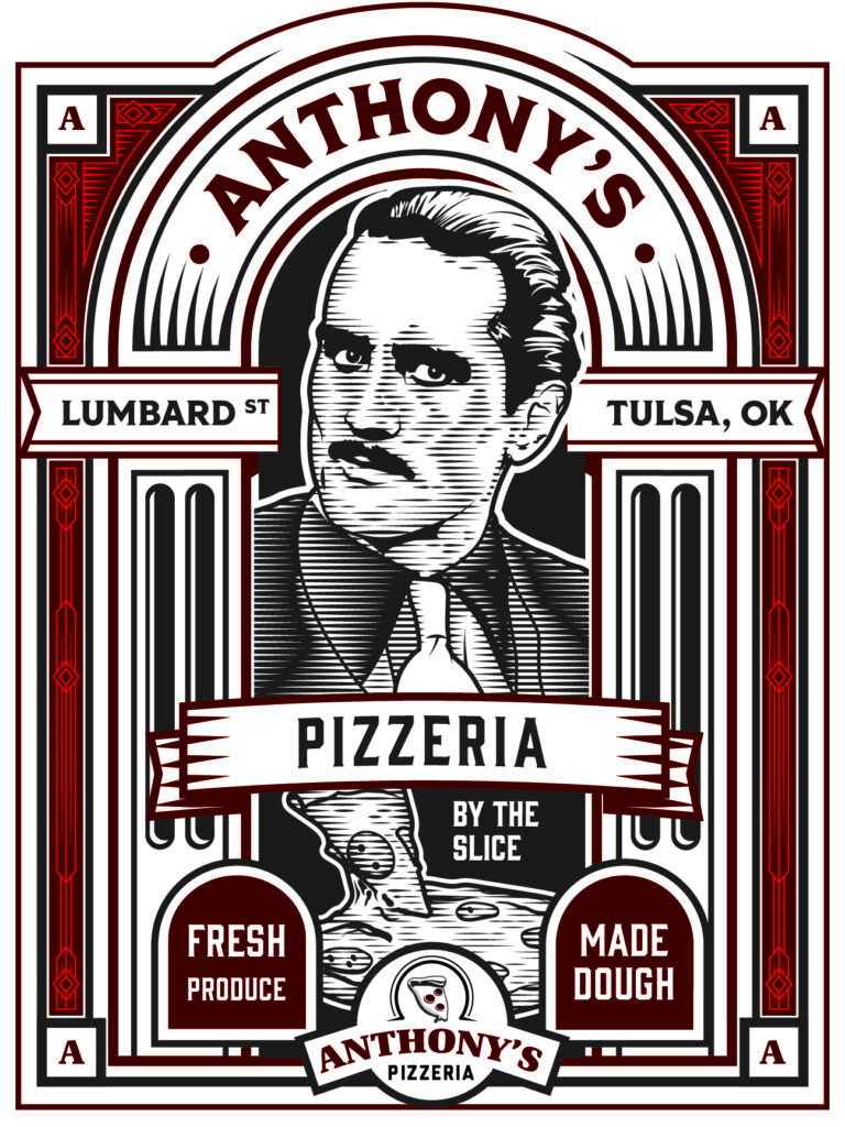
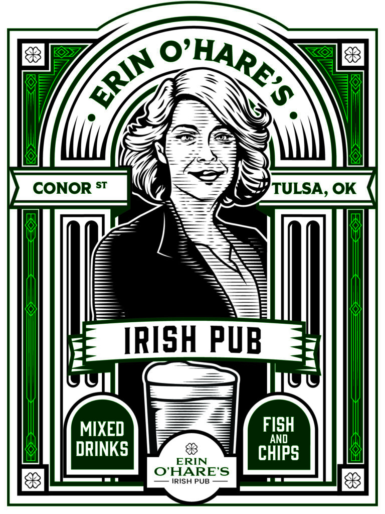
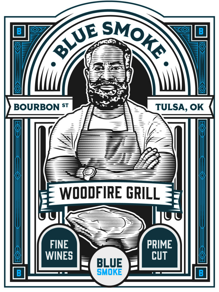
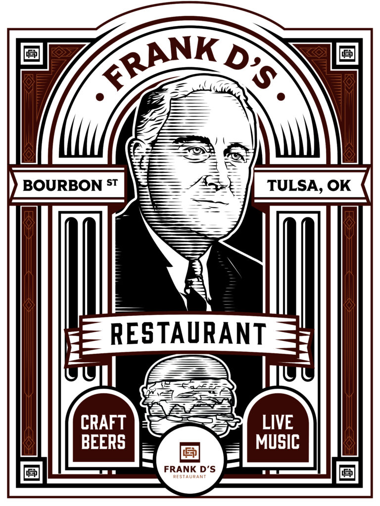
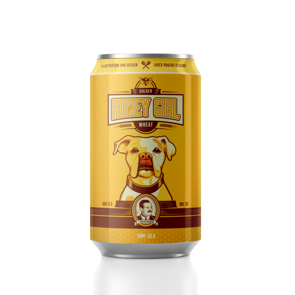
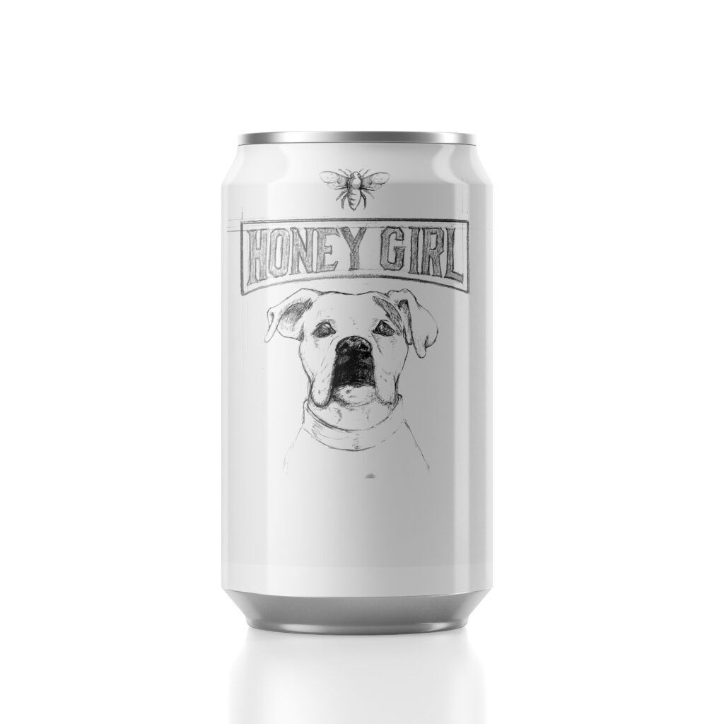
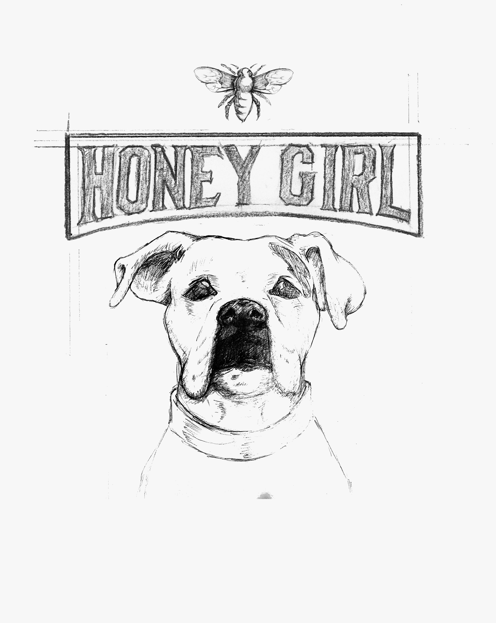
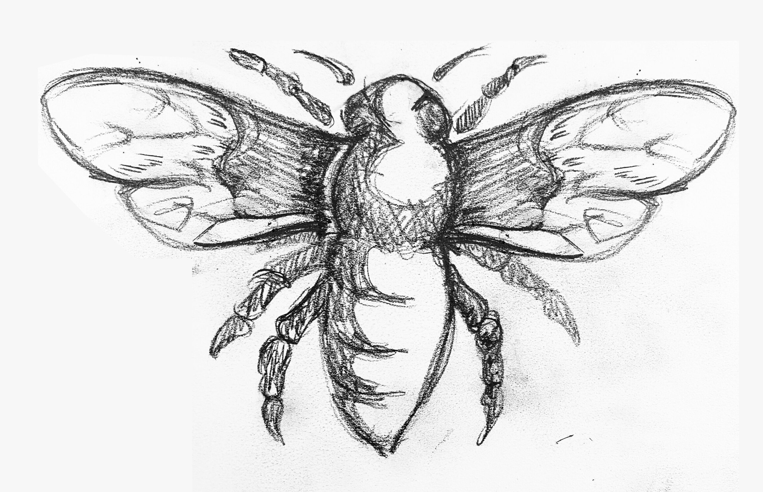
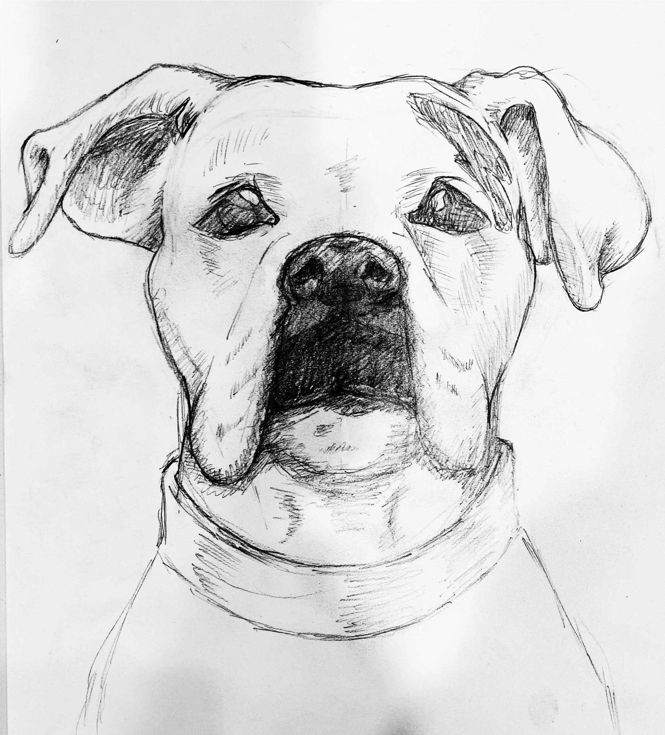
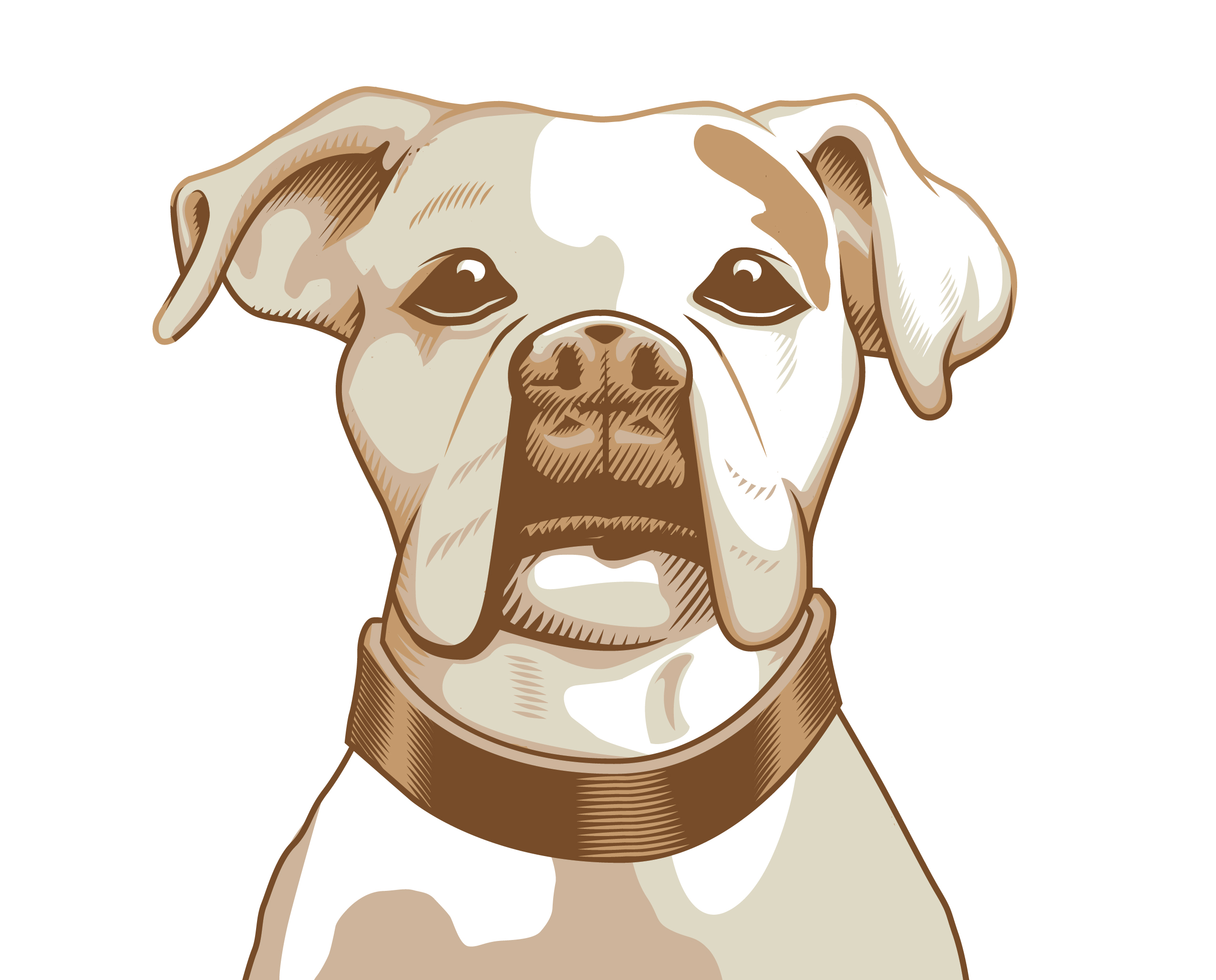
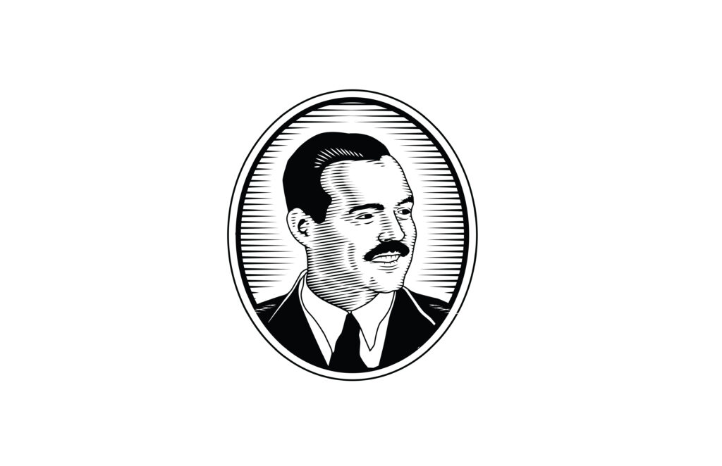
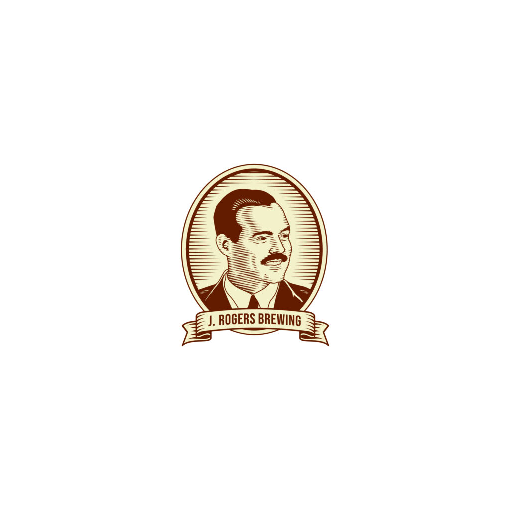
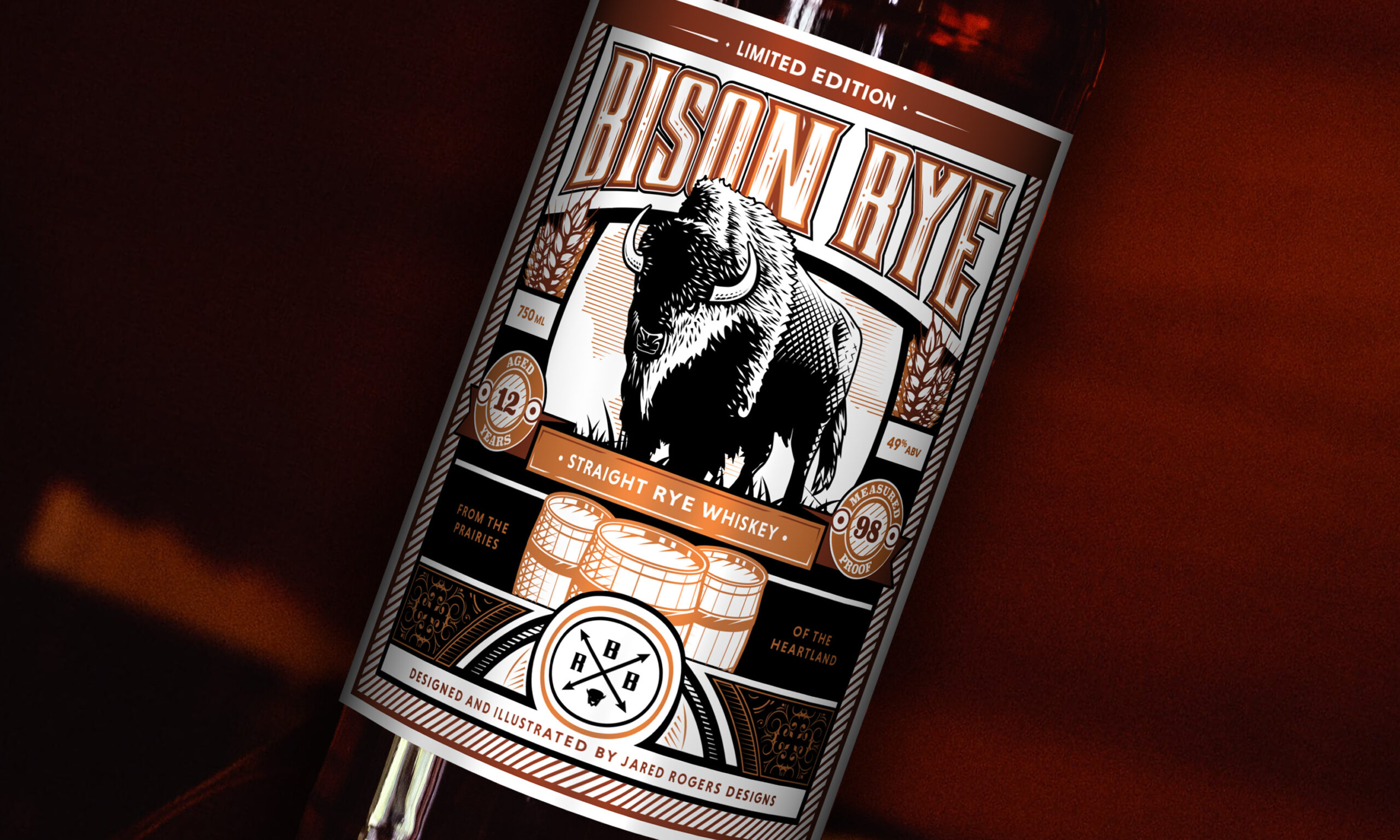
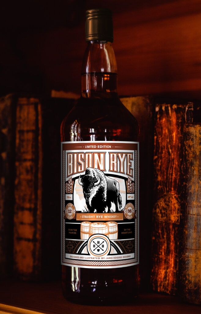
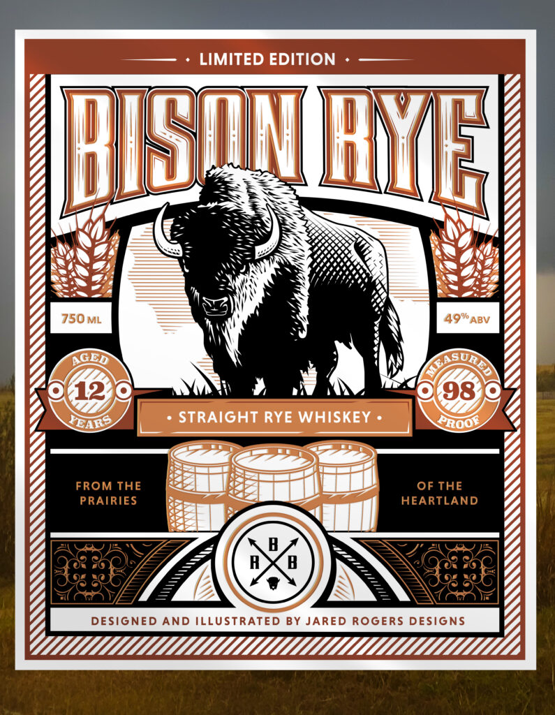
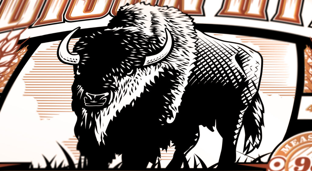
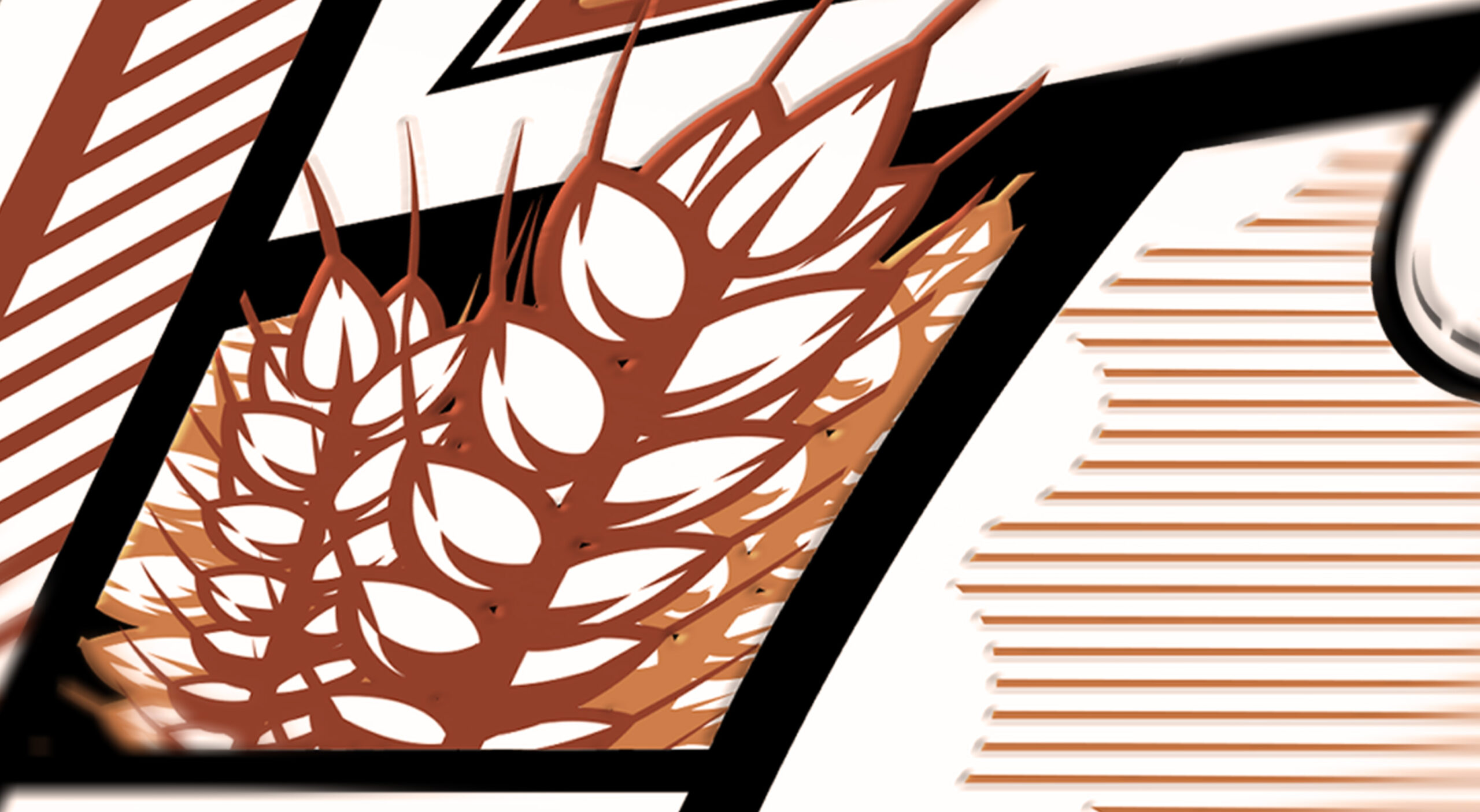
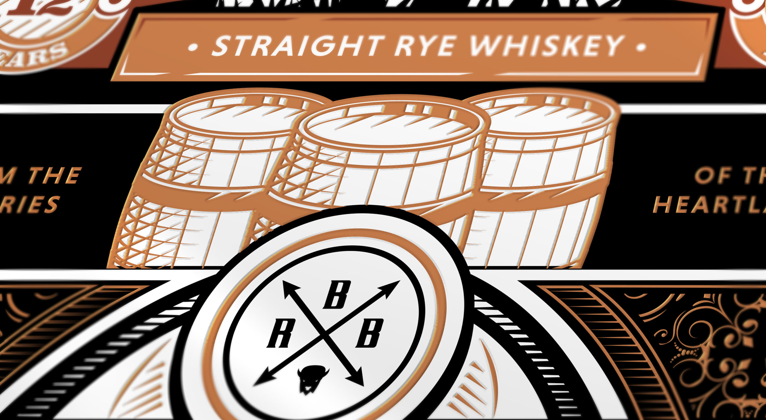
Off I went, deciding to focus on tradition and craftsmanship. The artist in me now wants to play, so off to the races. I had been working on sketching and ink etching during slow times, so I definitely had a bit of good visual content to build a design. After reviewing some design trends, I really liked that nostalgic design is back and a good design element. A couple of notable mentions about my inspiration came from Nathan Yoder’s design work for Pendleton’s Whisky. Also work by Steven Noble and Peter Voth. Please look at their work, they’re amazing. The second trend, that I noticed, was using gold accents in design to communicate prestige, but since I liked the idea of this for the average Joe, I incorporated copper accents. In my opinion, the visual appeal is there with a working man’s twist.
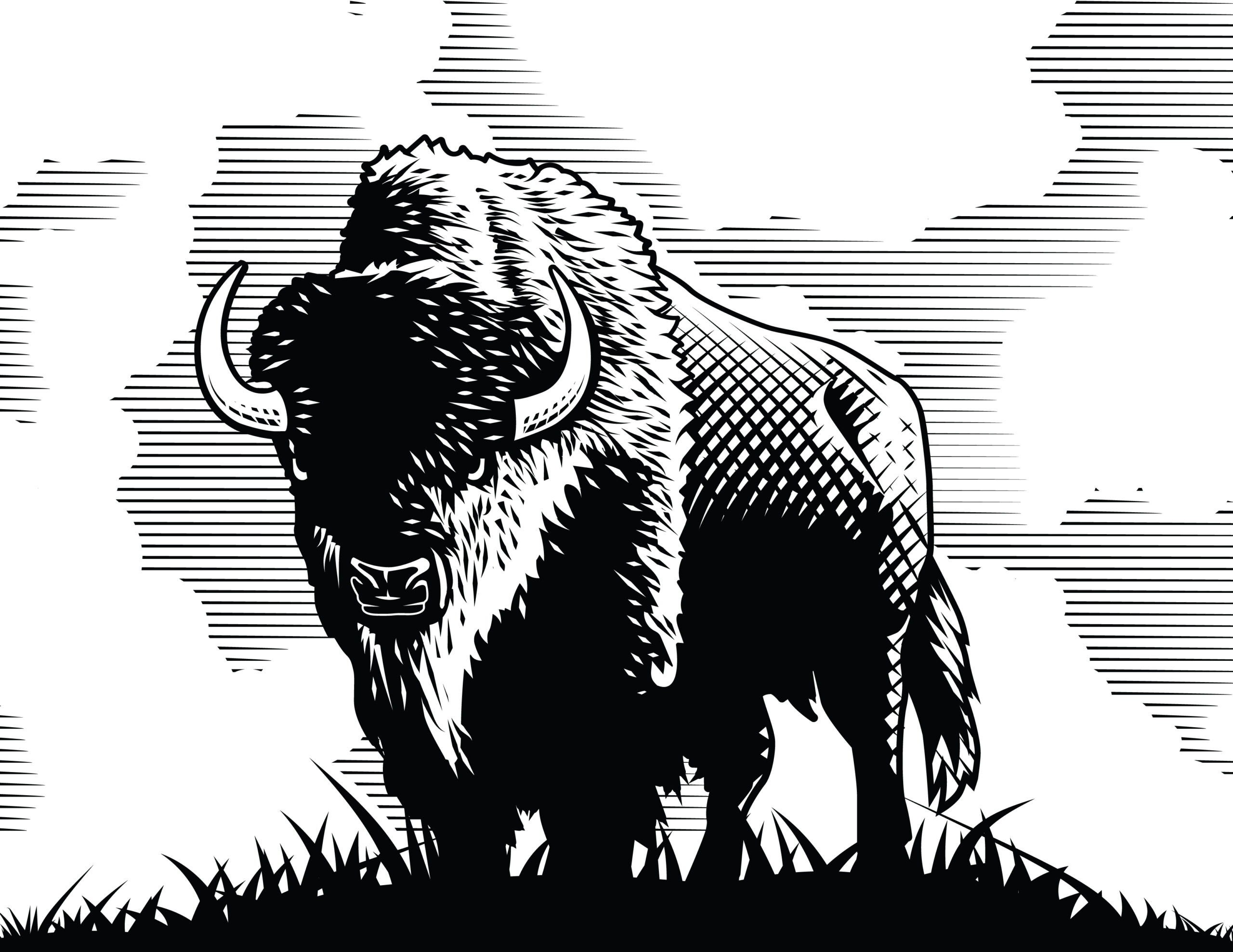
A head full of art and it still needed a vessel. I fell on the name Bison Rye Whiskey based on my Oklahoma heritage and in my research found out Rye Whiskey was one of the fast growing segments of the craft. I also had just finished a bison illustration that would be a great centerpiece. Just a note to let you know I did my research, there is Bison Rye, but no need to worry about that because Bison Rye is a variety of grass and can not be used to make whiskey.
Design notes:
The main reason I created this was because I would like to design a label one day, and until you start doing it, no one will believe you can or hire you. Also, until you try something, you really don’t know all the work involved. One reason I included numbers and statistics is because I always get work advice from friends and family suggesting I would make a “Killing”, if I did this one thing they saw for sell somewhere. Many times after looking into the product, you realize it would be really hard to make any real profit.
The moral here is, put yourself out there by doing the work and being in the shoe’s of those before you and remember to always look at the bottom line. Sometimes it really doesn’t matter how good you have done something, it’s just not worth that much to those who are willing to pay.
I hope you enjoyed this article and found it inspiring.
