Creative Portfolio
Jared Rogers
Senior Graphic Designer/Art Director
Art Director, Illustrator
and Graphic Designer
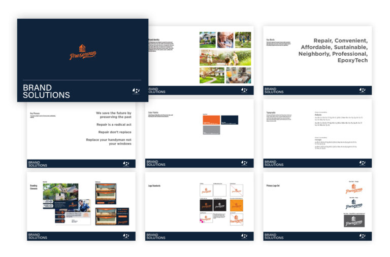
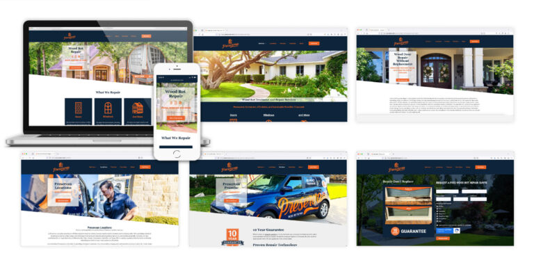
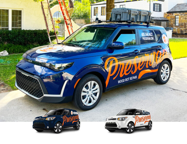
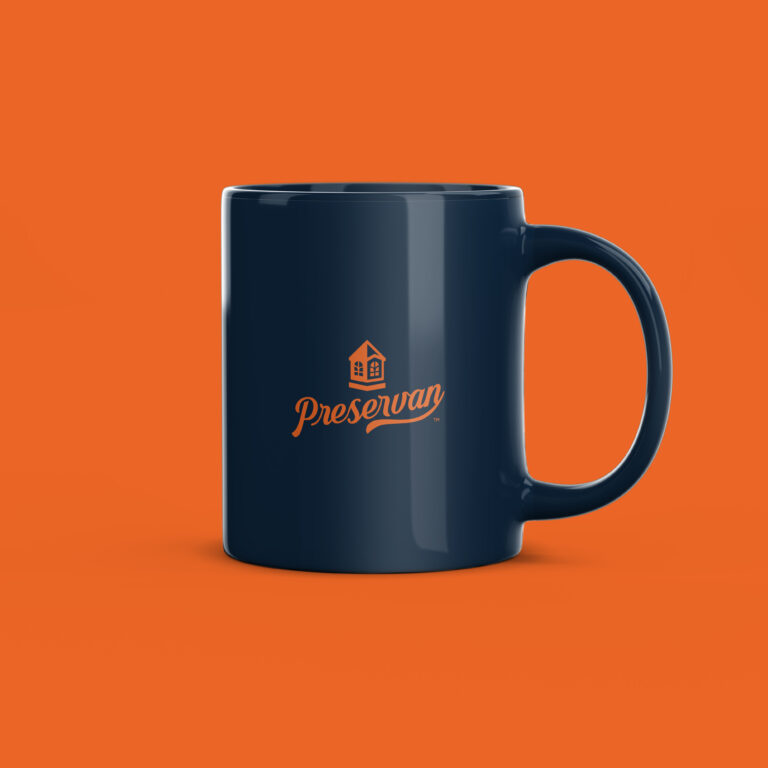
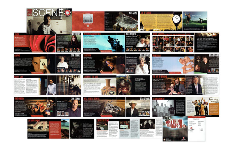
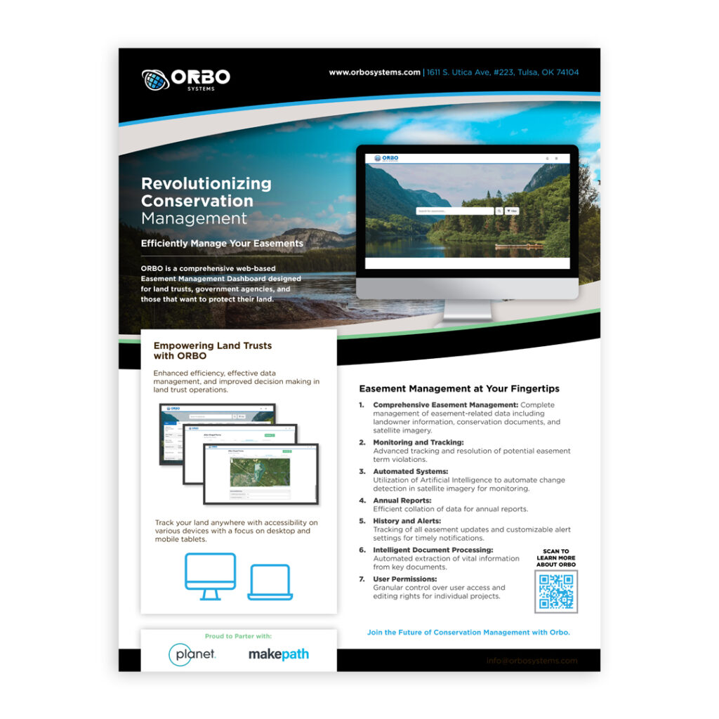
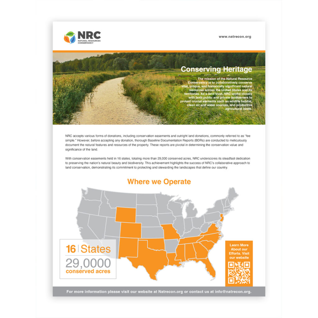
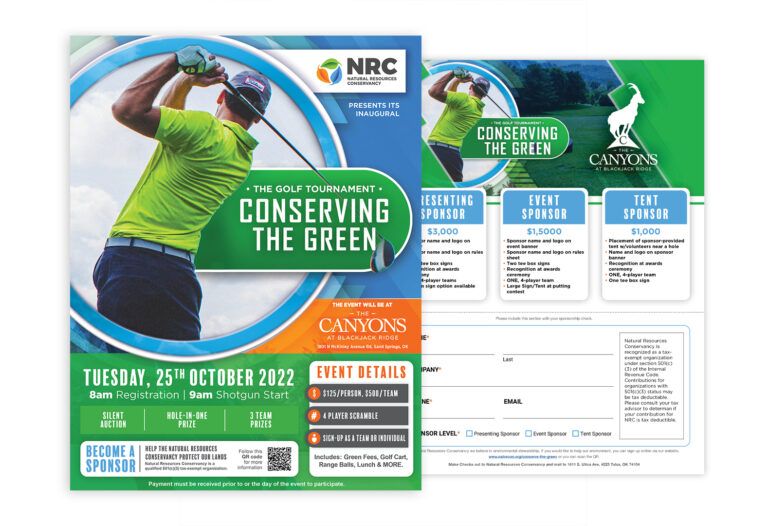
Art Director and Senior Graphic Designer with 15+ years of experience designing and evolving visual experiences that balance strong brand identity with usability, performance, and business outcomes. My background spans agency, in-house, and freelance environments, where he has led web, branding, and motion initiatives for regulated industries, higher education, healthcare, and multi-location businesses. I brings a mature design mindset, systems thinking, and proven collaboration with technical and business stakeholders.
Experience
Jared Rogers Designs, Tulsa, OK
Fall 2015 – Current
Freelance Graphic Designer
Community Higher Ed, Tulsa, OK
Fall 2017 – Spring 2019
Graphic Designer
Walsh Branding, Tulsa, OK
Spring 2012 – Fall 2015
Graphic Designer
St. John Health System, Tulsa, OK
Fall 2010 – Fall 2012
Graphic Designer
Cherokee Casino / Hard Rock Hotel & Casino Tulsa
Spring 2007 – Summer 2010
Graphic Designer
Skills
Branding & Systems: Brand Identity Systems | Design Systems | Style Guides | Component-Based Design | Digital Asset Creation | Marketing Collateral
Design & UX: UX Design | Web Design | Visual Design | Design Strategy | User Flow Design | Prototyping | Visual Storytelling
Motion: Motion Graphics Animation
Tools & Platforms: Adobe Photoshop | Adobe Illustrator | Adobe InDesign | Adobe After Effects | Adobe Acrobat | Adobe XD | Microsoft Office
Production & Collaboration: Cross-Functional Collaboration | Vendor Coordination | Art Direction | Creative Documentation | Research & Development
Brand Identity
Located in Tulsa, OK, ORBO Systems delivers near real-time updates on your land, automating the process to monitor and manage conservation easements. The brand naming combined orbital observation into a distinct name. The ORBO logo design and brand identity incorporate elements representing satellites and grid monitoring systems. The Mark was designed to be modern, professional, and complement parent company’s brand.
Preservan is a home repair business located in Oklahoma City, OK. Their mission is to eliminate wood rot and decay in homes. They save customers costs by using a proprietary epoxy resin system, offering a sustainable alternative to full replacements of windows, doors, and trim. I redesigned the logo and brand identity to incorporate an existing logo and developed brand standards for consistancy. The Mark is designed to be unique and representative of windows, dramatic improvements, and transformational repairs. The cupola represents their main focus and the night and day transformation process. The following is the Preservan’s Case Study.
Located in Tulsa, OK, Natural Resources Conservancy is a non-profit organization. Their efforts are dedicated to protecting forests, enhancing wildlife habitats, and preserving freshwater areas of land. I designed a logo and brand identity to incorporate branding standards. The Mark was designed to be professionally unique and representative of nature, conservation, and the environment. The “leaves” represent their conservation efforts for nature. Green for plants, orange for wildlife, and blue for freshwater. The following is the Natural Resources Conservancy Branding.
Bark+Bite is a start-up business offering a variety of dry rubs. The name originates from common smoking terms. “Bark” represents the outer crust of smoked meat, while “Bite” refers to the gentle heat that follows the burst of flavor. So, watch out!
The logo was sketched to represent a beloved pet boxer, and the packaging is an upscale vintage design is a nod to the complex flavors and the detailed ingredients. The Bark+Bite Brand Identity combines knowledge from logo research with that of the package designs.
Logo Design
Booklets and Brochures
One Sheets and Direct Mail
Promotional Posters
Websites
Marketing Campaigns
Illustration & Typography