Natural Resources Conservancy Branding
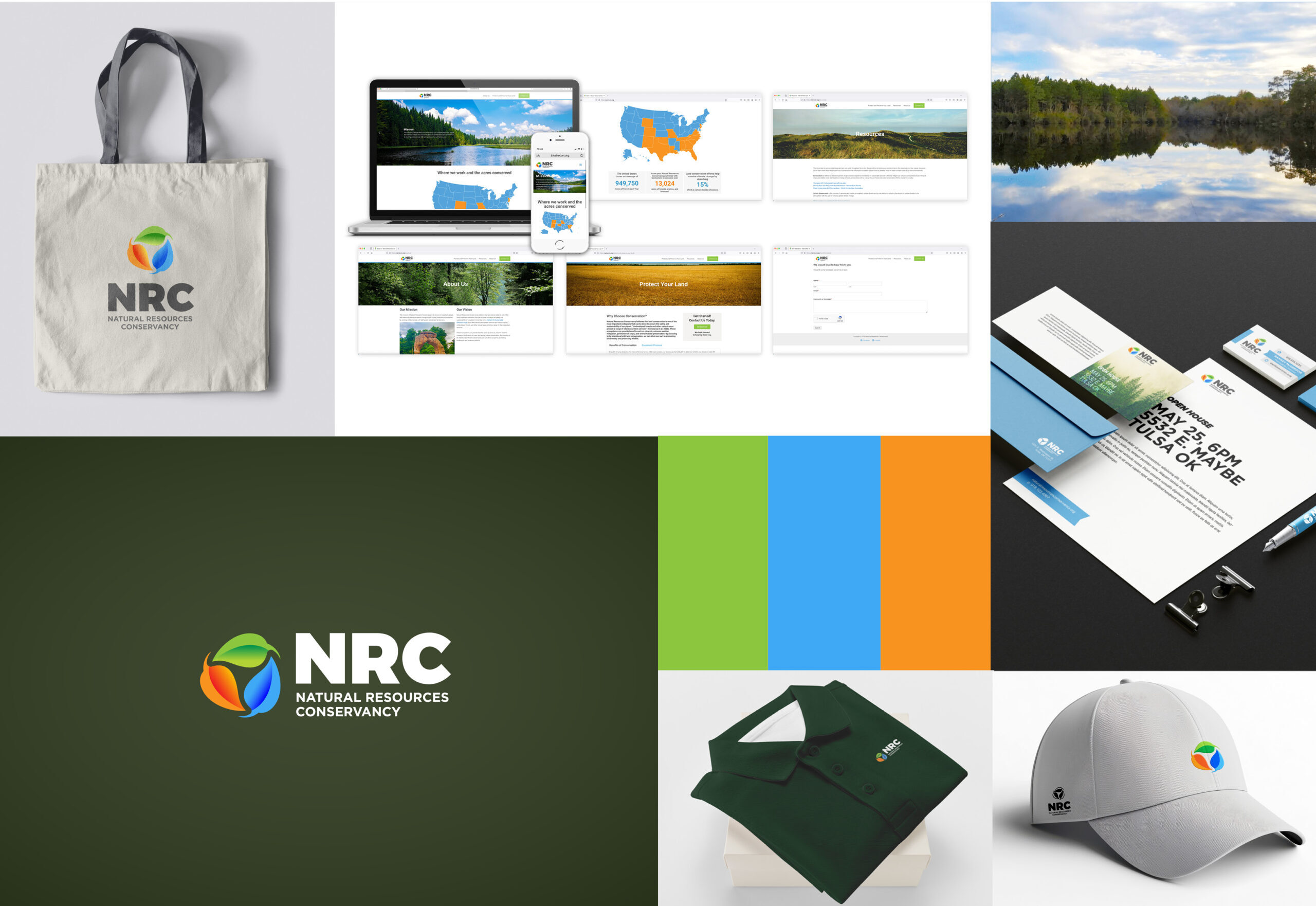
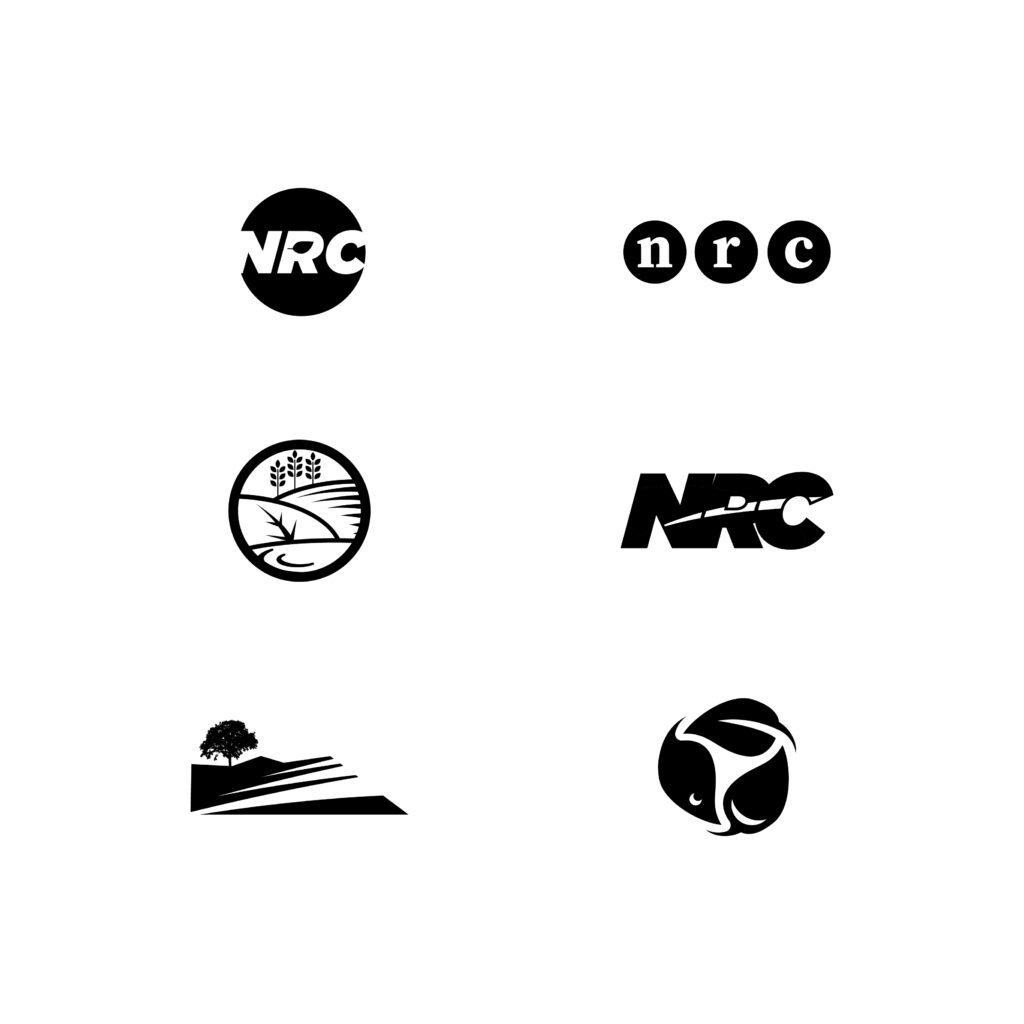
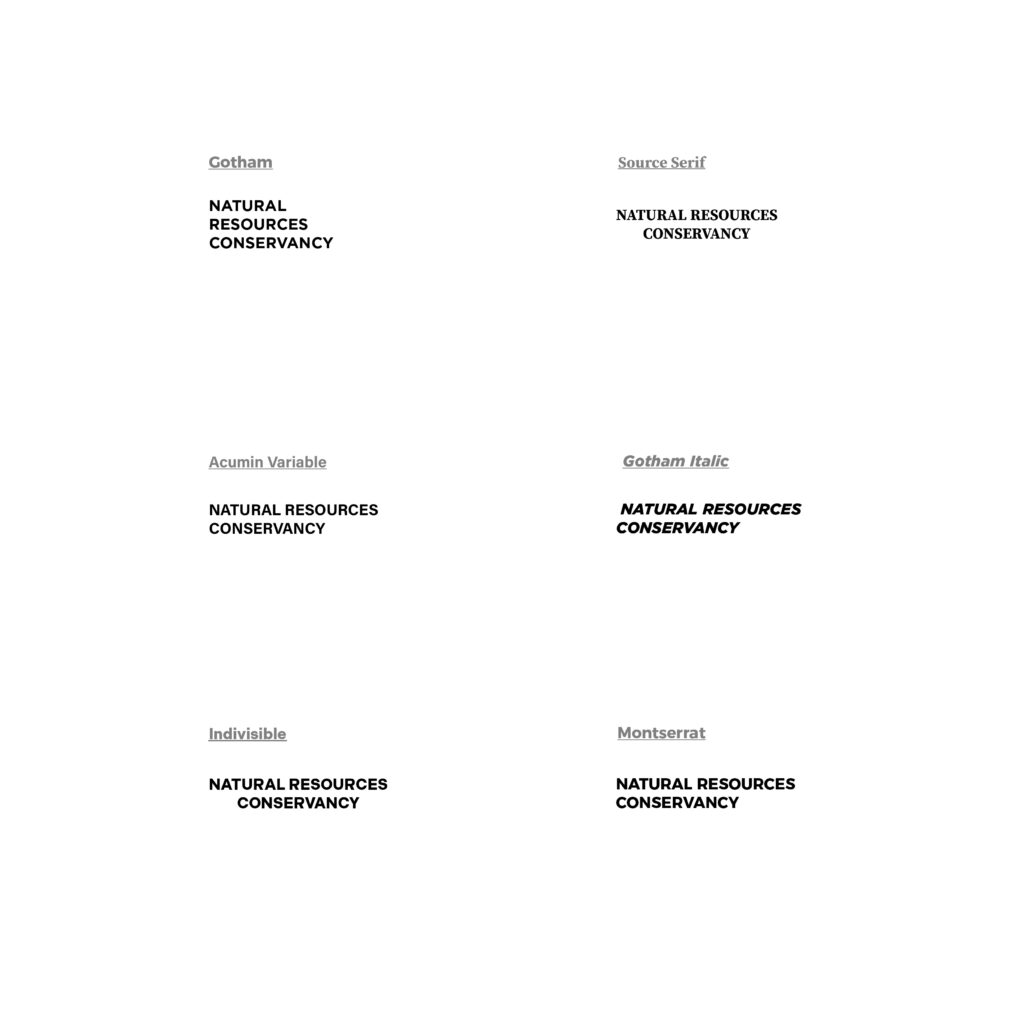
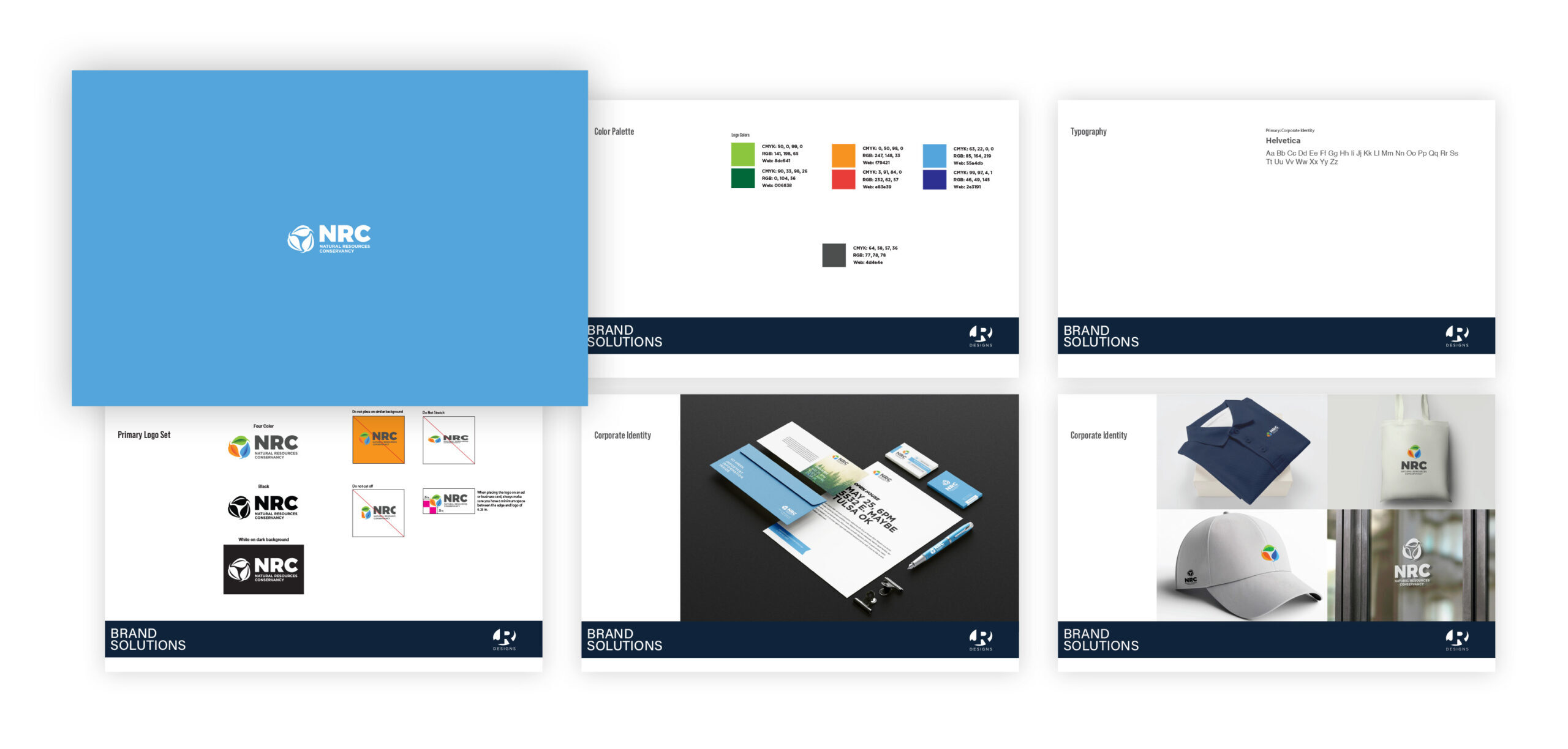
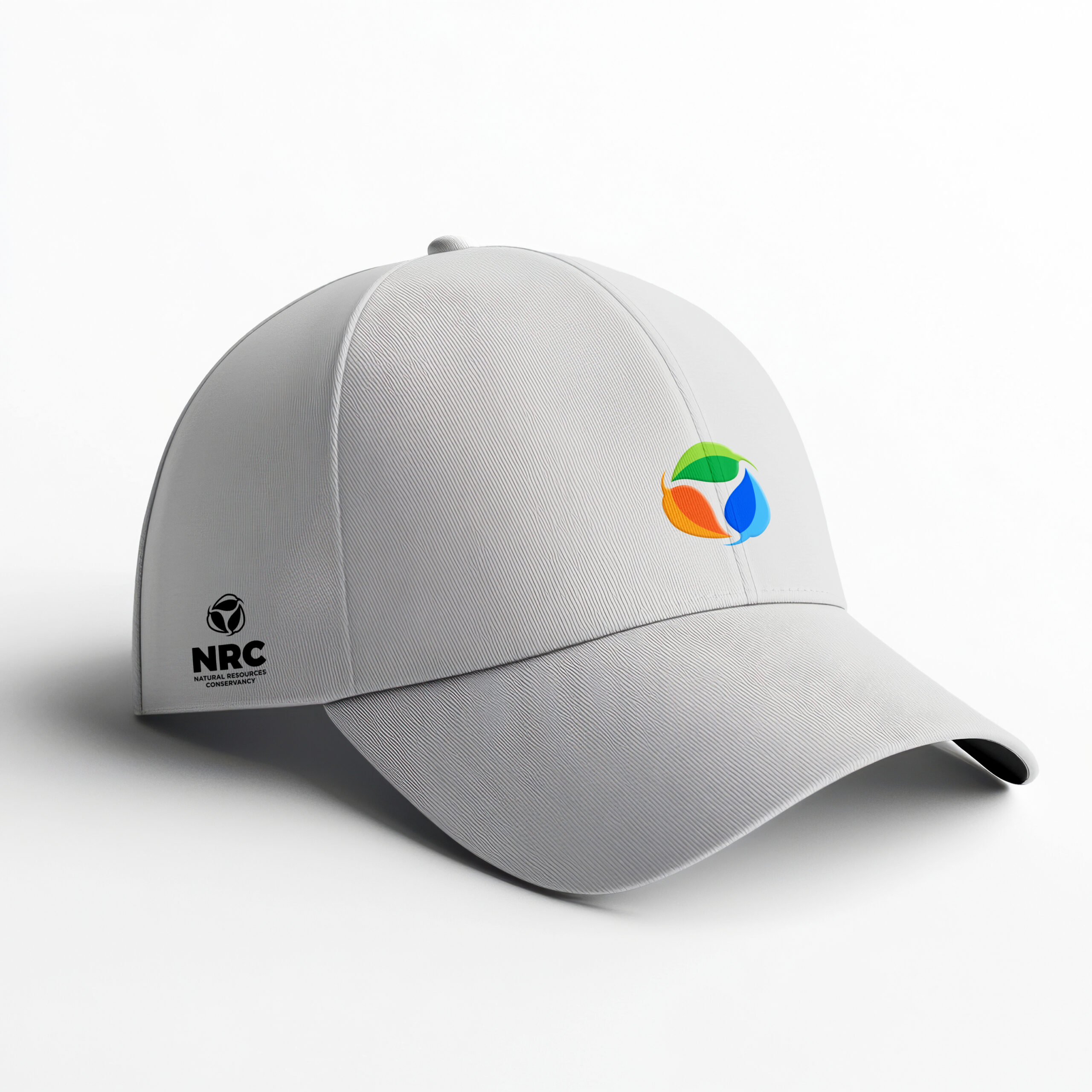
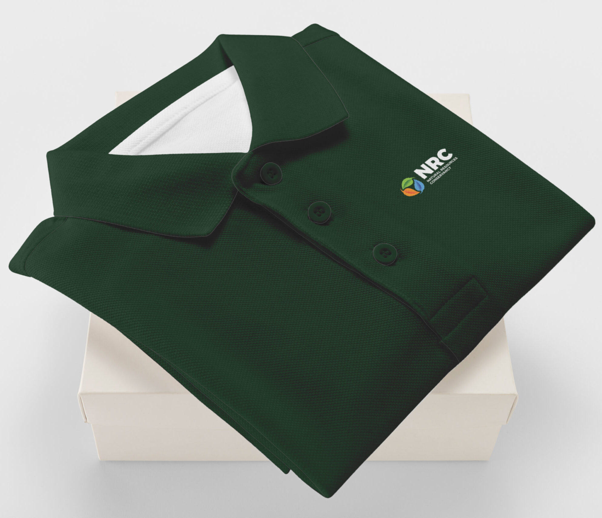
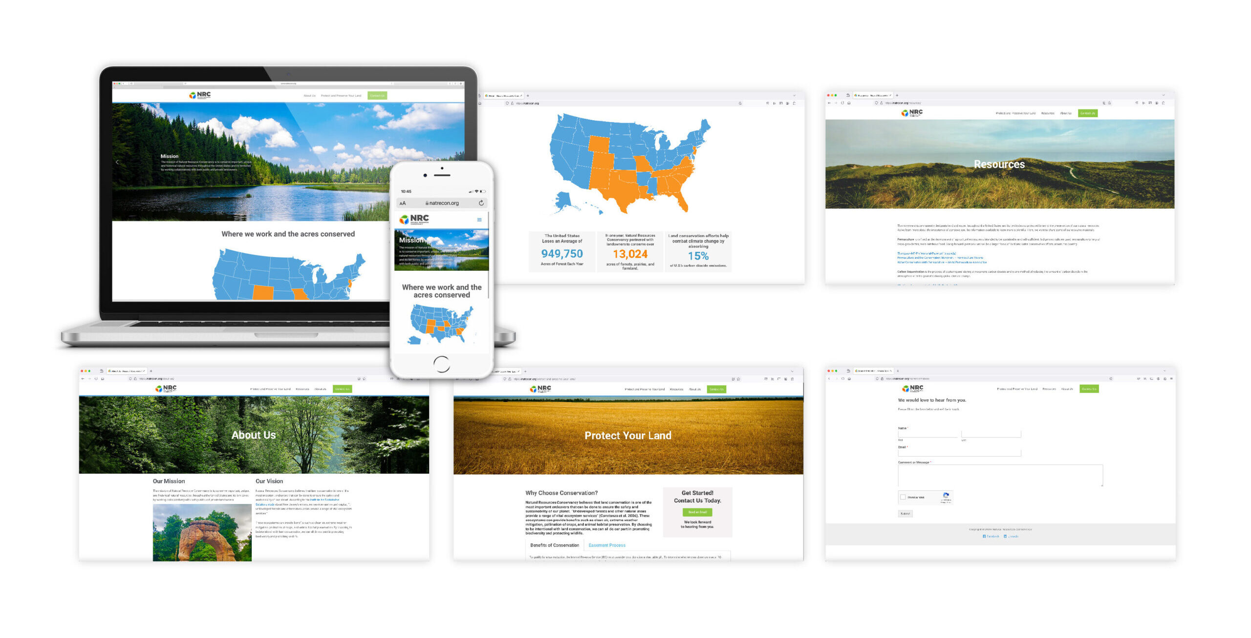
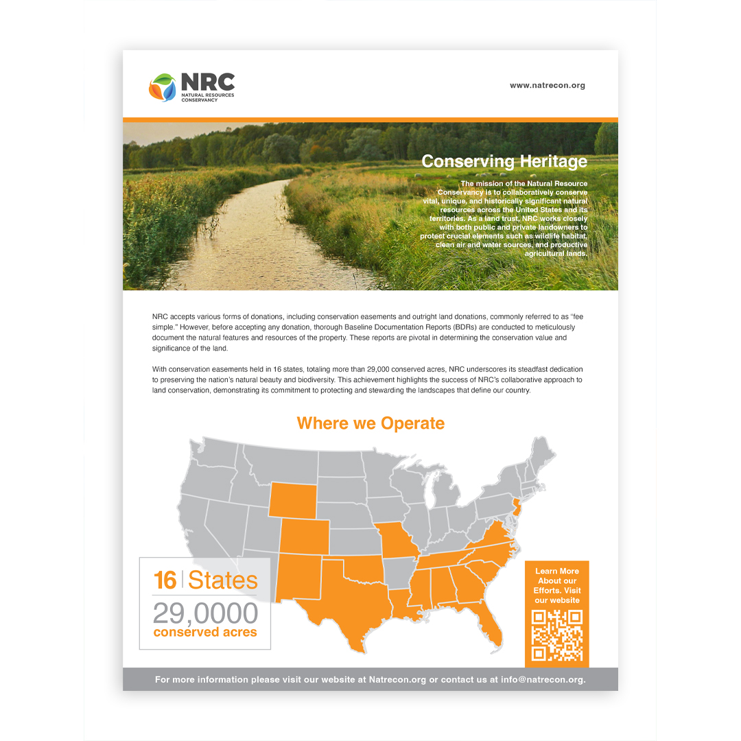
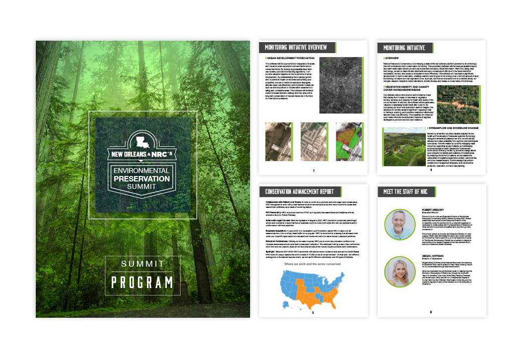
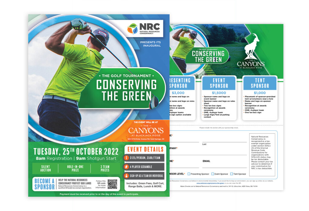
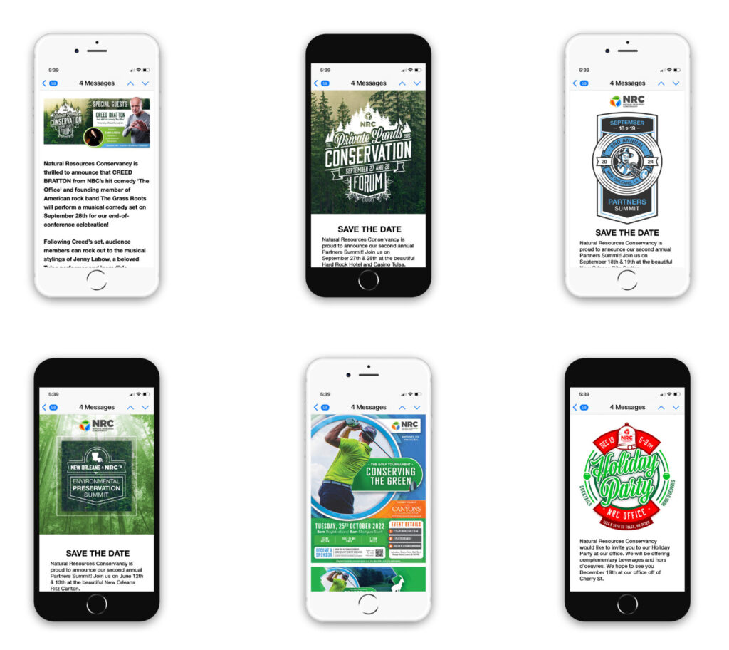
Located in Tulsa, OK, Natural Resources Conservancy is a non-profit organization. Their efforts are dedicated to protecting forests, enhancing wildlife habitats, and preserving freshwater areas of land. I designed a logo and brand identity to incorporate branding standards. The Mark was designed to be professionally unique and representative of nature, conservation, and the environment. The “leaves” represent their conservation efforts for nature. Green for plants, orange for wildlife, and blue for freshwater. The following is the Natural Resources Conservancy Branding.
Services Provided
– Art Direction
– Graphic Design
– Website Design and Development
– Brand Identity
Objective for the Identity
- Design a professional logo for an unknown non-profit.
- Make the branding communicate transparency and simplicity.
- Position the Natural Resources Conservancy as a positive and environmentally friendly conservation establishment.
- Develop a scalable logo system for future growth and prosperity.
Mark and Type Exploration
Website Design and Development
After the Natural Resources Conservancy Brand Identity, I designed and developed their website. Researching other non-profit land management websites, it was clear that the best approach was simplicity. The design needed to be clean, descriptive, and informative. Images of nature immerse users in the beauty of nature and explain why conservation is important.
Problem Solved
Designed a professional corporate logo representing land conservation, habitat conservation, and water conservation. Made it professional and friendly. Kept it clean for readability.
Brand Strategy
Land Conservation is not well-known in the industry, and I wanted the brand to appear transparent, user-friendly, and easily navigable. The website immersed users in the beauty of nature and explained the beauty of conservation. The logo design utilized a scalable system aiding in application.