Bark+Bite Brand Identity
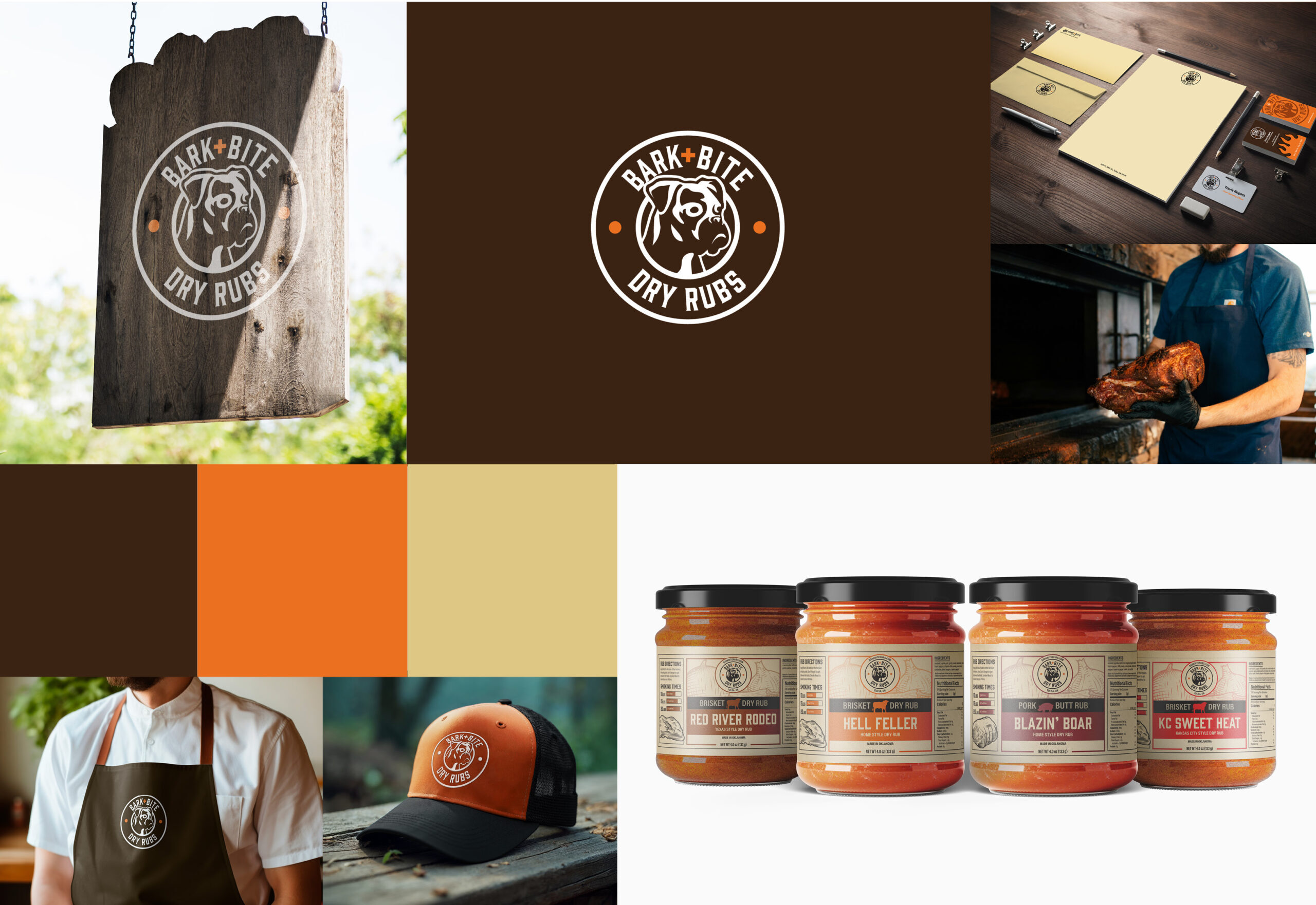
Bark+Bite is a start-up business offering a variety of dry rubs. The name originates from common smoking terms. “Bark” represents the outer crust of smoked meat, while “Bite” refers to the gentle heat that follows the burst of flavor. So, watch out!
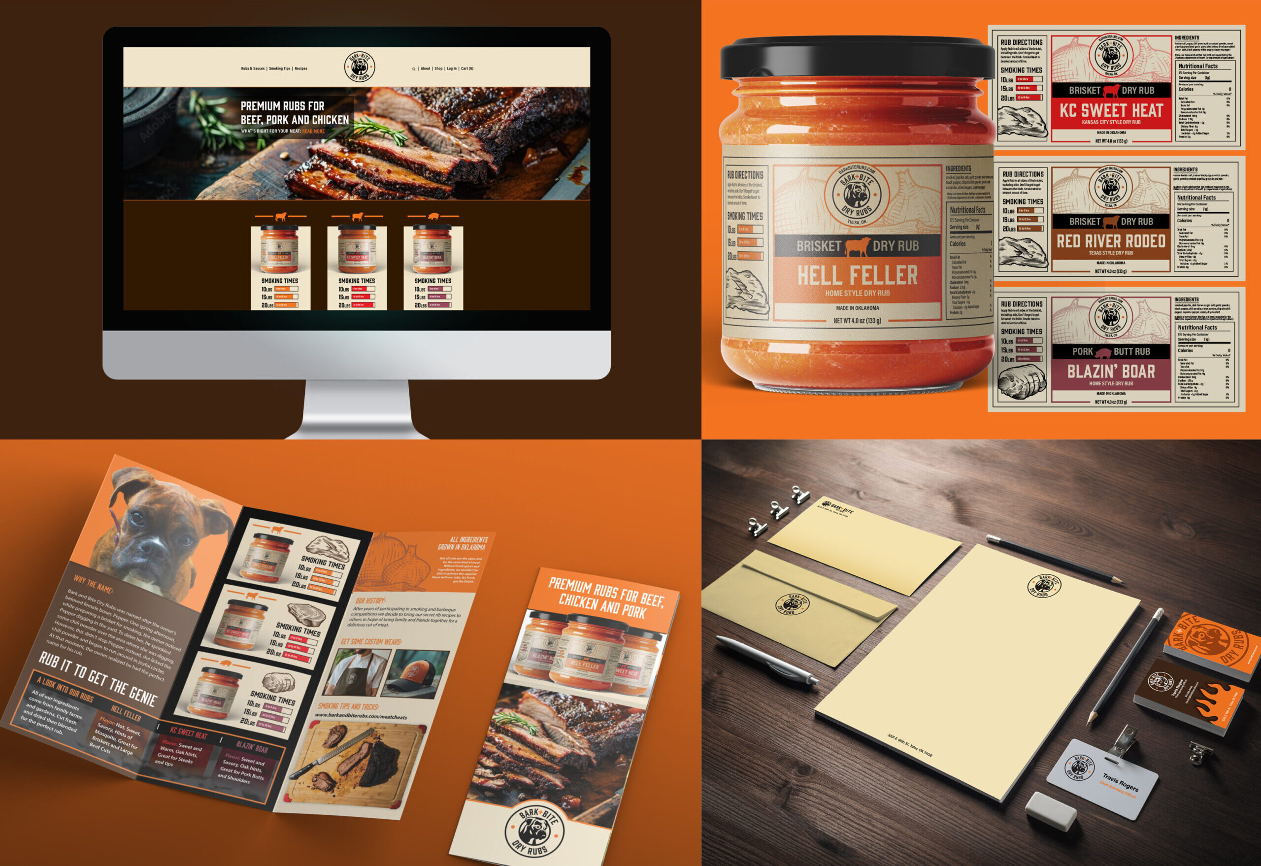
The logo was sketched to represent a beloved pet boxer, and the packaging is an upscale vintage design is a nod to the complex flavors and the detailed ingredients. The Bark+Bite Brand Identity combines knowledge from logo research with that of the package designs.
Services Provided
– Art Direction
– Graphic Design
– Package Design
– Brand Identity
Objective
- Design a unique logo featuring a family member
- Logo needed to be vintage, timeless and reflect name
- Design focus to 30 yrs old to 50 yrs old males
Problem Solved
Designed a professional corporate logo representing land conservation, habitat conservation, and water conservation. Made it professional and friendly. Kept it clean for readability.
Brand Strategy
Land Conservation is not well-known in the industry, and I wanted the brand to appear transparent, user-friendly, and easily navigable. The website immersed users in the beauty of nature and explained the beauty of conservation. The logo design utilized a scalable system aiding in application.