Hare's Fare Brand Identity
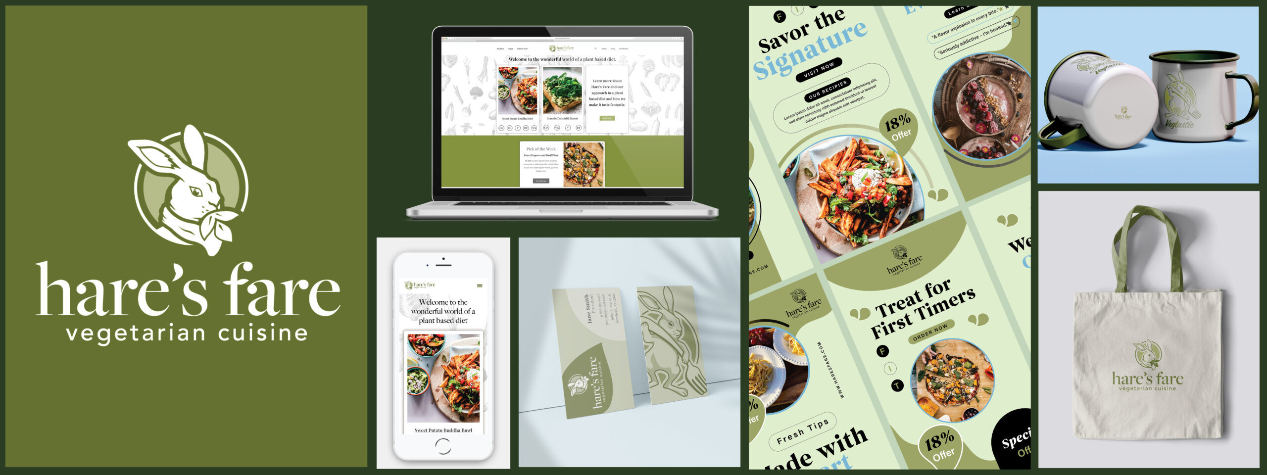
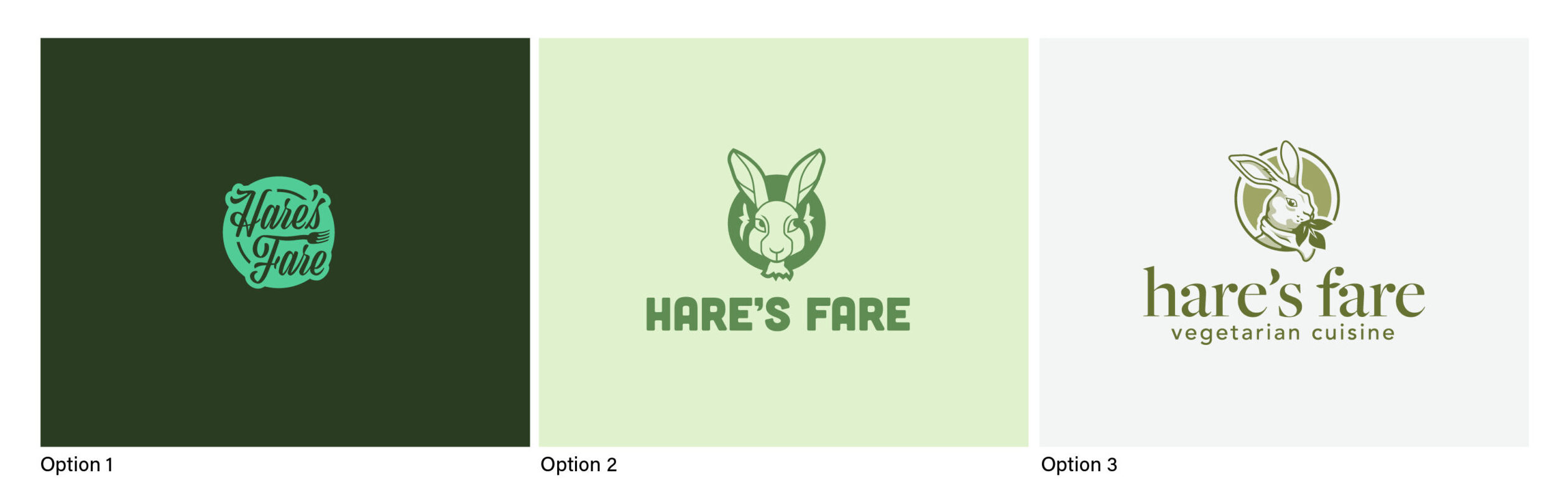
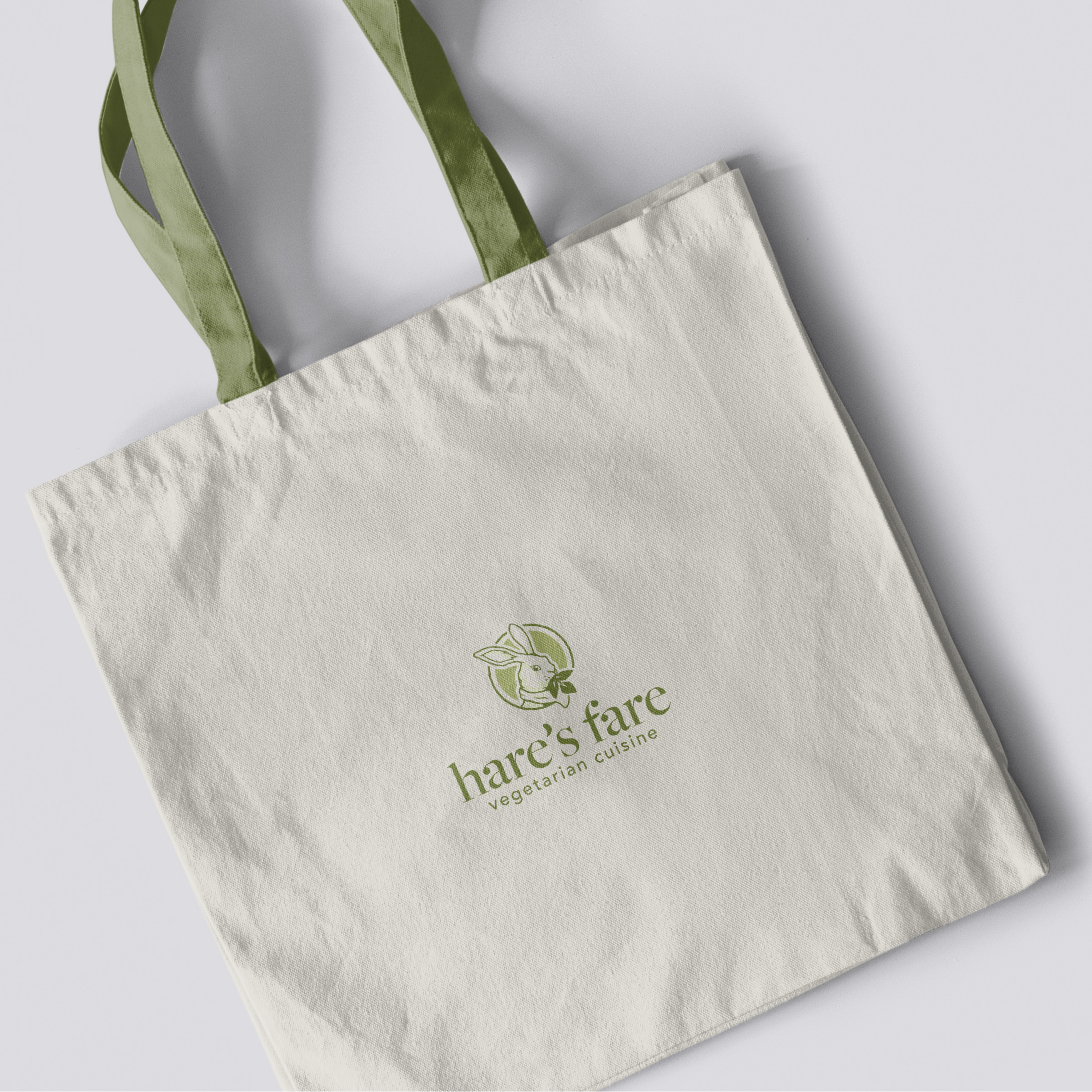
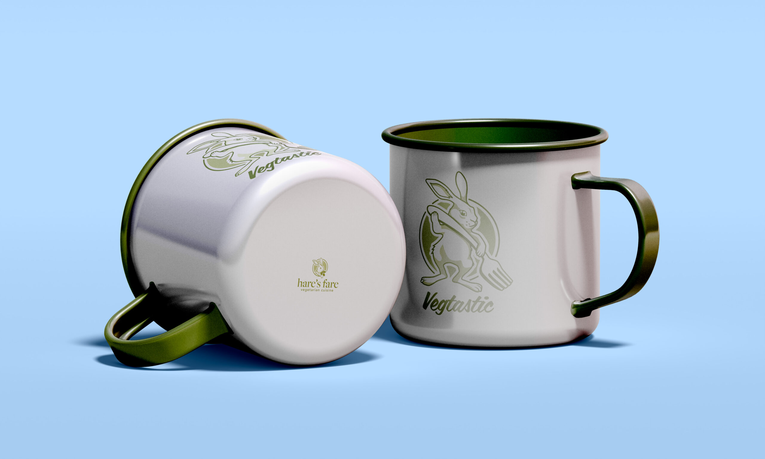
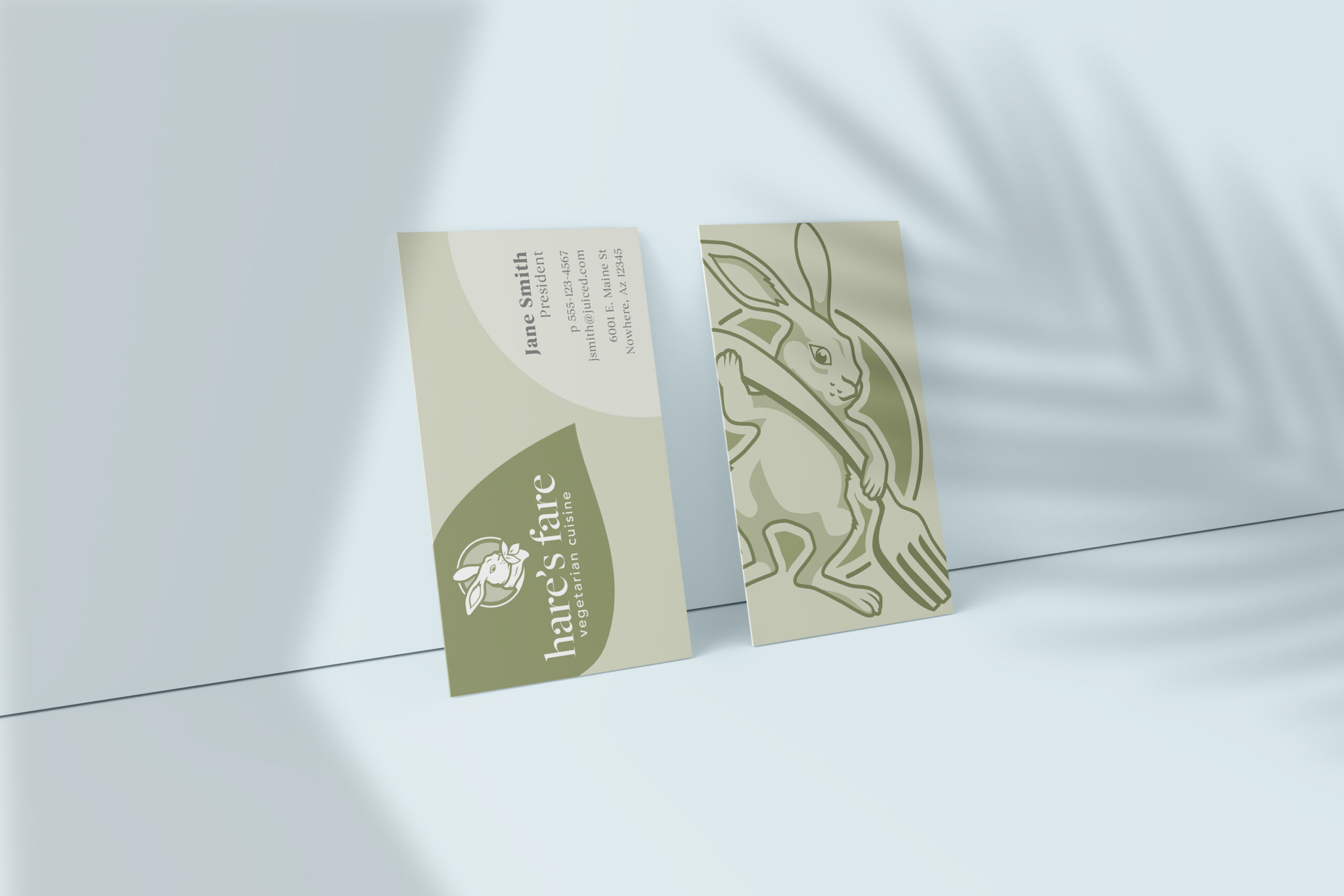
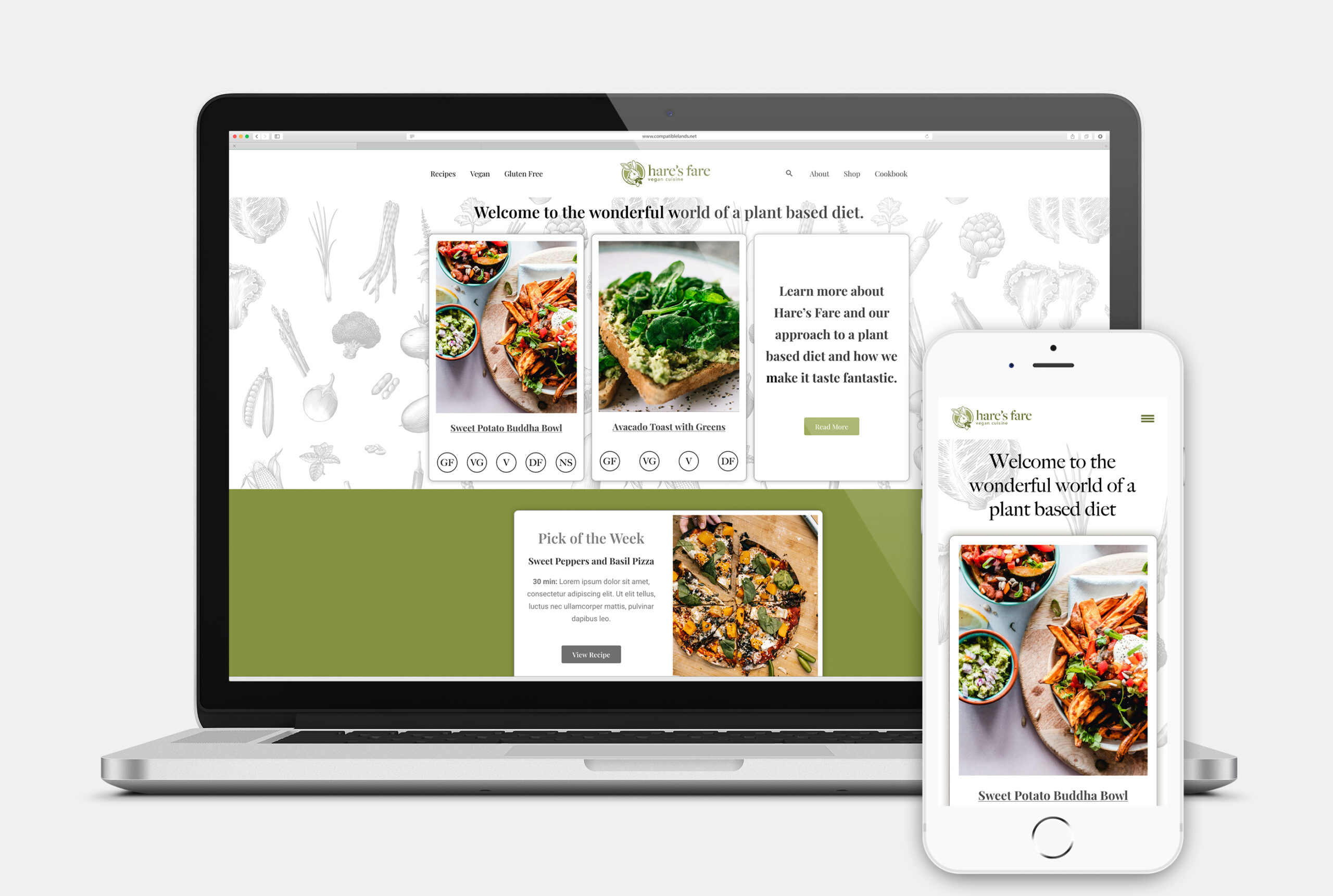
Hare’s Fare is a recipe website blog. The Branding and site were designed to offer delicious recipes that are both heart-healthy and environmentally conscious. Their mission is to promote healthy eating by offering tasty recipes for vegetarian and vegan cuisines. By minimizing animal consumption, individuals can help reduce the overuse of land, water, and natural resources. The following is the Hare’s Fare Branding.
Services Provided
– Art Direction
– Graphic Design
– Website Design
– Brand Identity
Objective for the Identity
- Introduce Vegetarian Benefits
- Logo needed to be inviting and engaging
- Promote Healthy Lifestyle
- Improve Planet Health
Logo Exploration
Website Design
The website design for Hare’s Fare focuses on popular recipes for vegetarians and vegans. By focusing on beautiful vegetarian meals, I was able to engage viewers with bright colors and images. The messaging also educates visitors about how diets impact environmental and sustainable practices. The work into Hare’s Fare Branding offered a sizable advantage with the design.
Problem Solved
Designed a professional corporate logo representing land conservation, habitat conservation, and water conservation. Made it professional and friendly. Kept it clean for readability.
Brand Strategy
Land Conservation is not well-known in the industry, and I wanted the brand to appear transparent, user-friendly, and easily navigable. The website immersed users in the beauty of nature and explained the beauty of conservation. The logo design utilized a scalable system aiding in application.